Checkerboard Floors Are Back – And They Look More Modern Than Ever
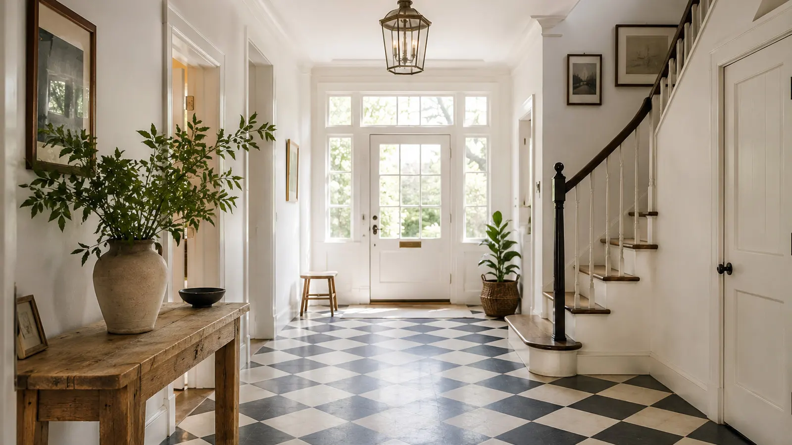
Checkerboard floors have never completely disappeared, but the versions returning to today’s interiors look remarkably different from the bold black-and-white floors many people still associate with the pattern.
The familiar geometry remains, yet almost everything around it has changed. Stark white is giving way to cream and ivory, deep brown and burgundy are appearing alongside traditional black, and materials such as honed marble, matte porcelain and handmade terracotta are softening what was once an intensely graphic look. Even vinyl has evolved enough to bring checkerboard flooring into projects where natural stone or ceramic tile may not be the most practical choice.
That shift is what makes the current revival interesting. Today’s checkerboard floors are defined as much by color, material, texture and scale as by the pattern itself. They can feel traditional or contemporary, playful or restrained, dramatic or quietly luxurious.
And perhaps that is the first thing worth reconsidering: if your idea of checkerboard still begins and ends with glossy black-and-white tile, you are looking at only a small part of what the pattern has become.
Why Are Checkerboard Floors Back?
For years, many residential interiors moved toward flooring designed to visually recede into the background. Pale wood, gray tones, beige surfaces and large uninterrupted areas created calm rooms in which the floor rarely became the main decorative element.
Now, the pattern is beginning to find its way back underfoot.
Houzz reported that searches on its platform for “checkerboard floor” increased by 38% during the first three quarters of 2025 compared with the same period a year earlier, while interest in bathroom checkerboard more than doubled.
The numbers are interesting, but they do not fully explain the return. The more important change is how designers are using the pattern.
Instead of treating checkerboard as a nostalgic reference, it is increasingly being used to give structure and character to otherwise restrained interiors. In a quiet kitchen, the floor can introduce movement without adding another decorative object. In an entryway, it can define the space before a piece of furniture is added. In a small bathroom, it can provide enough personality that the walls and fixtures are allowed to remain simple.
The checkerboard pattern has become less about recreating a particular period and more about introducing geometry into a room.
That distinction matters. A floor does not need to shout in order to be memorable.
What Makes Modern Checkerboard Floors Look Different?
The pattern itself has not changed. What has changed is almost everything around it.
Instead of relying on sharp contrast alone, modern checkerboard flooring uses color, material, surface finish and proportion to control how strongly the grid is perceived. The result can still be graphic, but it no longer has to feel theatrical.
Beyond Black and White
Black and white remains the most recognizable checkerboard combination, and there is good reason for that. The contrast is immediate, the geometry is unmistakable and the pattern works across many architectural styles.
But it is no longer the only convincing option.
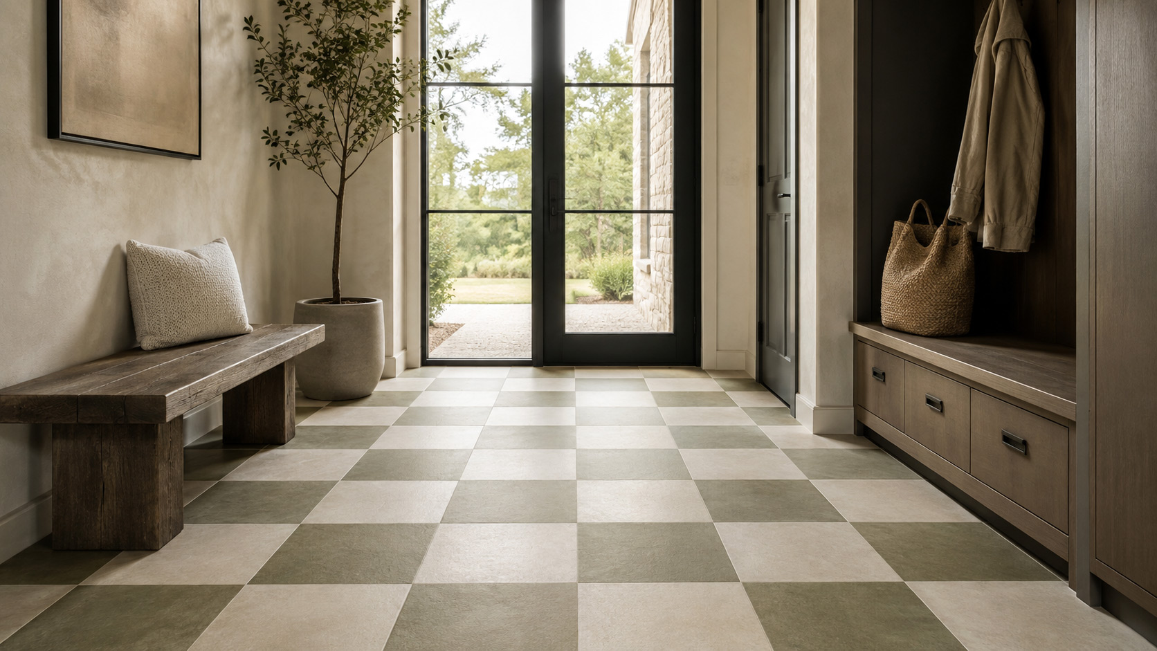
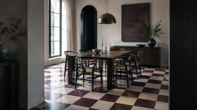
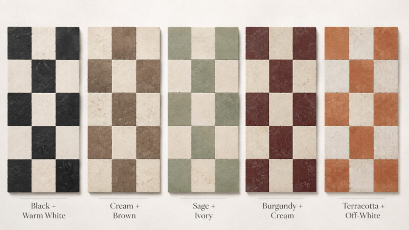
Cream paired with chocolate brown produces a much warmer result. Sage and ivory introduce color without overwhelming the room. Burgundy and cream can feel rich and decorative, while muted green, terracotta and softer stone tones make the pattern feel more connected to natural materials.
Houzz has highlighted combinations such as sage and cream, as well as deeper shades including burgundy, emerald and oxblood, as part of the renewed interest in checkerboard interiors.
Natural Materials and Softer Finishes
Material can alter the personality of a checkerboard floor even more dramatically than color.
A polished ceramic black-and-white floor creates a very different impression from honed marble, matte porcelain or slightly irregular terracotta. Natural variation in stone and clay breaks up the strict geometry of the grid, allowing the floor to feel more layered and less mechanically perfect.
Honed finishes are particularly effective because they reduce glare and allow subtle variations in veining, tone and texture to become part of the design. Porcelain offers a more controlled interpretation and can reproduce the appearance of marble or limestone with considerably less variation, while natural stone gives every installation a degree of individuality.
This is where modern checkerboard begins to move away from nostalgia. Pair it with warm oak cabinetry, plaster-like walls, natural textiles and softer finishes, and the same basic grid suddenly belongs to a completely different interior language.
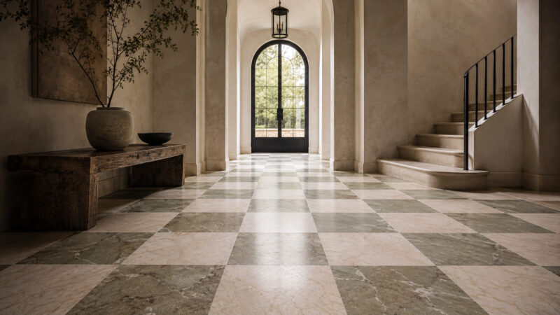
Natural stone takes that idea further, particularly with marble checkerboard floors, where variations in veining and color soften the repetition of the pattern.
From Oversized Squares to Micro-Check
Scale is another element that can completely change the character of the floor.
Larger checkerboard squares create fewer visual transitions and can make a spacious kitchen or entryway feel calmer and more architectural. They also allow materials such as marble to show more of their natural veining and tonal variation.
At the opposite end of the spectrum, smaller checks create a denser and more decorative surface. The emerging micro-check look takes this even further, using a much tighter grid that can work particularly well in compact bathrooms, backsplashes and smaller areas where the pattern is intended to become a deliberate design feature.
Good Housekeeping recently highlighted this smaller-scale interpretation as an emerging tile trend.
Checkerboard Tile Floors: The Most Versatile Version of the Trend
For many homeowners, tile is the most straightforward way to introduce the checkerboard look into a kitchen, bathroom, mudroom or entryway. Checkerboard tile floors can be created with porcelain, ceramic or natural stone, giving the same geometry very different levels of texture, formality and durability.
Porcelain is often the practical all-rounder. It performs well in areas exposed to moisture and heavy use, while modern manufacturing allows it to imitate marble, limestone and other natural materials with impressive realism. That makes it possible to create a refined checkerboard floor without accepting all of the maintenance requirements that come with real stone.
Ceramic can offer a similar aesthetic in suitable residential applications and is available in an enormous range of colors and finishes. The right choice depends on the room, the expected level of use and the individual product rather than on appearance alone.
Surface finish deserves just as much attention as material. A glossy checkerboard floor tile emphasizes contrast and reflection, while matte or softly textured tiles tend to create a calmer and more contemporary result.
And what do you want people to notice first: the pattern or the material?
If the grid itself should dominate, stronger contrast and a more uniform surface will emphasize every square. If you want the floor to sit more quietly within the architecture, softer color combinations and subtly textured surfaces can produce a more restrained effect.
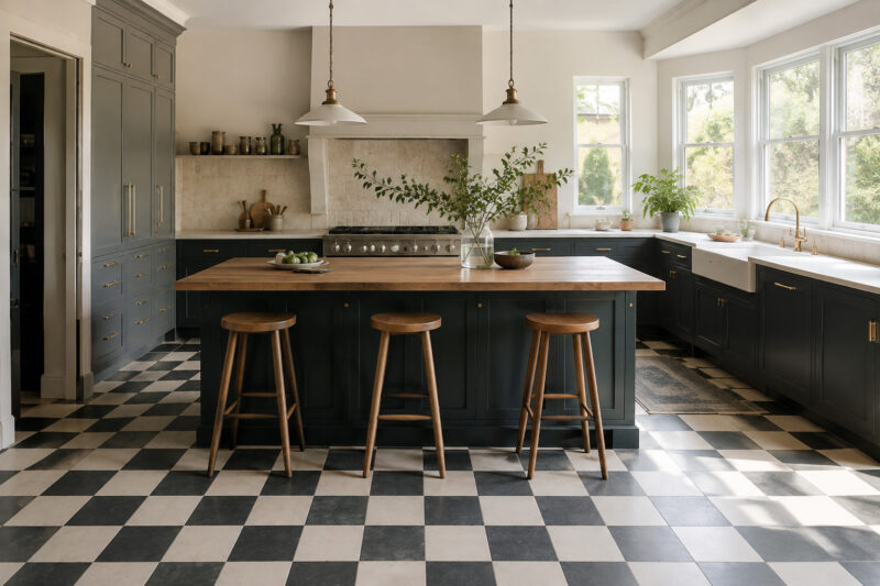
Grout also plays a larger role than it may seem. Highly contrasting grout outlines every tile and strengthens the geometry, while a grout color closer to the tile tones creates a more continuous surface. In kitchens and bathrooms, practical issues such as stain resistance, cleaning and moisture exposure should influence the choice as well.
The strength of tile is flexibility. Checkerboard can be bold or understated, traditional or contemporary, depending on how those decisions are combined.
Marble Checkerboard Floors Bring a More Luxurious Look
Marble is where checkerboard often stops feeling simply decorative and starts becoming part of the architecture itself.
A marble checkerboard floor preserves the strong geometry of the pattern, but natural variation prevents it from appearing overly rigid. No two pieces of stone are exactly alike, so the repetition of the grid is constantly interrupted by subtle differences in veining, tone and texture.
Black and white remains the obvious classic, but marble opens the door to far more nuanced combinations. Cream and brown can create a warm and understated effect, while white paired with muted green or burgundy introduces color without abandoning the elegance associated with natural stone.
Finish changes the result again. Polished marble reflects more light and usually feels more formal, while honed marble tends to appear quieter and more contemporary. In bathrooms, entryways and other areas where moisture or foot traffic matters, surface characteristics should also be considered from a practical standpoint.
Marble does, however, ask more from its owner than porcelain. Natural stone is generally more sensitive to staining, scratching and acidic substances, and some varieties require periodic sealing. For a heavily used kitchen, that may matter more than the beauty of the sample in a showroom.
So is marble the best checkerboard material? Not universally.
But for projects where natural variation is part of the appeal and the floor is intended to become a defining feature of the space, marble checkerboard floors can be difficult to equal.
Checkerboard Vinyl Flooring Makes the Look More Accessible
Not every project needs the weight, installation demands or maintenance requirements of tile and natural stone. For many renovations, checkerboard vinyl flooring offers a much more practical route to the same geometric effect.
Modern vinyl has moved considerably beyond the glossy sheet floors many people still associate with older interiors. Depending on the product, checkerboard layouts can be created with individual vinyl tiles, luxury vinyl products or pre-patterned sheet flooring, with surfaces designed to reproduce stone, ceramic and other materials.
Vinyl can also feel warmer and slightly softer underfoot, which is particularly noticeable in kitchens, laundry rooms and utility spaces where people spend long periods standing. Installation may be simpler as well, although that depends heavily on product type, subfloor condition and installation method.
It also opens the door to less traditional color combinations. Cream and brown, muted green and ivory or warm charcoal and off-white can create a checkerboard floor that feels contemporary without trying to imitate marble.
The important caveat is quality. Wear layer, construction, dimensional stability, water resistance and installation method can vary significantly between products. With a repeated geometric pattern, accurate alignment is especially important because small installation errors can become visible across the entire floor.
For anyone who likes the checkerboard look but does not necessarily want the cost or maintenance requirements of stone or ceramic, checkerboard vinyl flooring can be a genuinely practical alternative.
Quick comparison: Vinyl vs. tile
| Vinyl | Porcelain/Ceramic Tile | |
| Feel underfoot | Softer and warmer | Harder and cooler |
| Installation | Can be simpler | Usually more involved |
| Maintenance | Generally easy | Easy, but grout needs care |
| Design flexibility | Very high | Very high |
| Natural-material feel | Lower | Higher, especially with quality tile |
| Best fit | Practical remodels | Long-term, high-use installations |
Checkerboard Kitchen Floors Have Moved Beyond the Retro Diner Look
The kitchen may be the room where checkerboard has had the hardest retro stereotype to shake. Black-and-white floors were so closely associated with diners and nostalgic interiors that the pattern can still immediately trigger that image.
Place the same geometry next to warm oak cabinetry, a restrained stone countertop and modern lighting, however, and the association changes almost instantly.
A contemporary checkerboard kitchen floor can still be black and white, but cream and brown, warm gray and ivory or muted green combinations often integrate more naturally with wood cabinetry and neutral surfaces. The pattern becomes part of the room rather than a theme applied on top of it.
The amount of visual competition in the kitchen is worth considering. If the room already contains strongly veined countertops, dark cabinetry, open shelving and several contrasting finishes, does the floor really need to become another focal point?
Probably not.
In that situation, a lower-contrast checkerboard can provide structure without fighting the rest of the room. In a simpler kitchen, stronger contrast may be exactly what gives the space its personality.
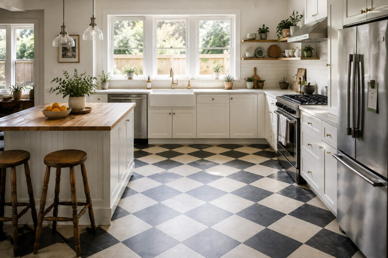
Scale follows the same principle. Larger checks tend to feel calmer in open-plan kitchens, while smaller squares create a more decorative and energetic result. Material choice should reflect everyday use as well: porcelain and ceramic suit demanding kitchen conditions, while vinyl may offer greater comfort and installation flexibility.
The most successful checkerboard kitchen floors are rarely chosen in isolation. They respond to cabinetry, countertop, room proportions and the amount of flooring that will actually remain visible once the kitchen is furnished.
Checkerboard Bathroom Floors Can Give Small Spaces More Character
Bathrooms are one of the easiest places to experiment with checkerboard because the floor area is usually contained. The pattern can introduce contrast and personality without requiring the rest of the room to become equally decorative.
But a common concern remains: if the bathroom is already small, will a checkerboard floor make it feel even busier?
It can, but it does not have to.
A checkerboard bathroom floor with larger squares and relatively soft contrast may actually feel cleaner and more graphic than a tiny, highly repetitive pattern. Smaller checks create more visual activity and can work particularly well in powder rooms, where the limited floor area turns the pattern into an intentional design feature.
Material choice becomes more important in wet spaces. Suitable porcelain and ceramic products are often practical options because they are available in moisture-resistant finishes and are generally easier to maintain than natural stone. Marble can create a much richer effect, but porosity, surface finish and maintenance requirements deserve careful consideration.
Slip resistance should never be treated as an afterthought. A highly polished surface may photograph beautifully, yet a bathroom floor also has to work around tubs, showers and wet feet. Matte or honed finishes can often provide both a softer visual character and a more appropriate surface for everyday use.
Grout influences the result too. Strong contrast makes every square more pronounced, while a grout tone closer to the tile color can visually soften the grid.
In a small room, these details determine whether checkerboard bathroom floors feel deliberate and sophisticated or simply too busy.
Black and White Checkerboard Floors Are Still a Classic
With so much attention now going to cream, brown, sage, burgundy and natural stone, it would be easy to assume that traditional black and white checkerboard floors are being left behind.
They are not.
Black and white remains the clearest and most recognizable expression of the pattern. What has changed is the way it is being surrounded.
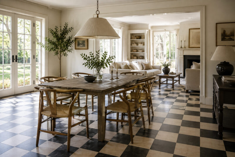
Warm oak or walnut immediately softens the contrast. So do off-white walls, natural textiles and quieter furniture. Even replacing a bright, cool white with a warmer ivory can make the same black-and-white grid feel considerably less severe.
Surface finish matters here perhaps more than anywhere else. Highly polished black-and-white tile strengthens the graphic effect and can easily evoke a very specific period. Matte or honed surfaces reduce reflection and allow the floor to sit more comfortably in contemporary residential interiors.
Scale changes the mood as well. Smaller black and white checkerboard tile creates more energy, while larger-format squares make the same two-color combination feel cleaner and more architectural.
If you love black and white but worry that it will look too retro, changing the colors may not be necessary at all.
Sometimes the better answer is to change the finish, proportion and materials around the floor.
How to Choose the Right Checkerboard Floor Colors
Color has as much influence on the character of a checkerboard floor as the geometry itself. The same pattern can feel dramatic, quiet, traditional, rustic or contemporary depending on how much contrast exists between the two tones.
Before choosing from a sample board, look at what is already permanent in the room: cabinetry, countertops, wall tile, woodwork, stone and large pieces of furniture. The checkerboard floor has to live with those elements long after the inspiration image disappears from your screen.
Black + Warm White
This remains the classic combination, but replacing stark white with a warmer tone can soften the contrast considerably. It pairs especially well with oak, walnut, brass and other warm finishes.
Best for: kitchens, hallways, bathrooms and entryways.
Cream + Brown
Cream and brown is one of the easiest ways to introduce checkerboard into a warm contemporary interior. It sits naturally alongside wood cabinetry, beige stone, plaster-like walls and other earthy materials.
Best for: kitchens, dining areas and larger entryways.
Sage + Ivory
Muted green introduces color without making the floor visually aggressive. It works particularly well with natural materials and softly painted cabinetry.
Best for: kitchens, mudrooms and bathrooms.
Burgundy + Cream
This pairing is richer and more expressive. The deeper tone gives the pattern depth, while cream keeps it from becoming excessively dark.
Because it creates a stronger statement, it usually works best when the rest of the interior remains relatively restrained.
Best for: entryways, powder rooms and dining spaces.
Terracotta + Off-White
Terracotta gives checkerboard an earthy, informal character and works particularly well with natural wood, textured walls, stone and relaxed Mediterranean-inspired interiors. Slight irregularities in handmade tiles can make the geometry feel even softer.
Best for: kitchens, sunrooms and entryways.
One simple rule
The stronger the contrast, the stronger the floor.
If the room already contains dramatic cabinetry, highly veined stone or multiple competing patterns, a softer checkerboard palette will usually create better balance. If everything else is restrained, a higher-contrast floor can become the feature that gives the room personality.
The goal is not to choose the most fashionable combination. It is to choose two colors that belong with the permanent elements around them.
What Size Checkerboard Pattern Works Best?
There is no single checkerboard size that works in every room. The right scale depends on the dimensions of the space, how much flooring will remain visible and whether you want the pattern to behave as a focal point or as a quieter architectural element.
Small Checks: More Detail, More Energy
Smaller squares create a denser pattern and therefore more visual activity. They can work beautifully in powder rooms, narrow entryways and compact bathrooms, especially when surrounding surfaces remain simple.
In a room that already contains several patterns or heavily detailed finishes, however, a small checkerboard can become visually exhausting.
Classic-Sized Checks: The Most Flexible Choice
If you are unsure about scale, starting in the middle is usually sensible.
Classic proportions provide enough repetition for the checkerboard to be clearly recognizable without making the surface excessively busy. They work across kitchens, bathrooms, mudrooms, hallways and entryways and are generally easier to integrate than either extreme.
Oversized Checkerboard Floors Feel More Architectural
Larger squares reduce the number of transitions across the floor and can make the pattern feel calmer and more deliberate.
This is particularly effective in spacious kitchens, larger entryways and open-plan interiors. Oversized formats can also showcase natural materials more effectively because each piece of marble or stone has enough surface area for its veining and tonal variation to become visible.
Micro-Check Works Best as a Deliberate Feature
Micro-check uses a much denser grid and can behave almost like a textile pattern.
In a powder room or compact bathroom, that can be charming. Across a large open kitchen, the same amount of repetition may become overwhelming.
A useful way to think about scale is:
- small room + small checks → more decorative and energetic
- small room + larger checks → cleaner and more graphic
- large room + small checks → visually active
- large room + oversized checks → calmer and more architectural
There is one more variable people often overlook: how much flooring will actually be visible. A large kitchen filled with cabinetry and an island may expose less floor than a much smaller but emptier entryway.
Tile, Marble or Vinyl: Which Checkerboard Floor Is Right for You?
Once the pattern and colors are decided, the harder question is often the material.
Do you prioritize durability, natural variation, comfort, easier installation or lower maintenance? The answer will influence far more than appearance.
Porcelain and Ceramic Tile: The Practical All-Rounder
Porcelain offers one of the strongest balances between durability, ease of maintenance and design flexibility. It works particularly well in kitchens, bathrooms, mudrooms and entryways and can reproduce the look of marble or stone without requiring the same level of care.
Ceramic can also be an attractive choice in appropriate residential applications, particularly when budget and variety are important.
For projects where natural stone maintenance is not desirable, checkerboard tile floors are often the logical starting point.
Marble: The Most Distinctive and Luxurious Option
Natural marble offers variation that manufactured surfaces can imitate but never reproduce exactly. Veining, color differences and small imperfections make each installation unique and prevent the checkerboard geometry from becoming too uniform.
The trade-off is additional care. Marble is more sensitive to staining, scratching and acidic substances, and maintenance should be considered before appearance alone makes the decision.
For interiors where the floor is intended to become part of the architecture itself, marble checkerboard floors remain one of the most distinctive options.
Vinyl: The Flexible and Practical Option
For renovations where installation, comfort, weight or cost play a major role, vinyl deserves serious consideration.
A well-chosen product can reproduce the checkerboard geometry convincingly while offering a warmer, more forgiving surface in certain applications. It will not reproduce every characteristic of natural stone, nor does it need to.
Its strength is practicality.
Checkerboard vinyl flooring makes particular sense when the visual pattern matters more than recreating the exact feel of stone or ceramic.
Quick Comparison
| Material | Best For | Main Strength | Main Consideration |
| Porcelain | Kitchens, bathrooms, entryways | Durability | Hard and cool underfoot |
| Ceramic | Residential interiors | Variety and price | Performance varies by product |
| Marble | Premium interiors | Natural variation | More maintenance |
| Vinyl | Remodels, kitchens, utility areas | Flexibility and comfort | Less natural-material charact |
So which one should you choose?
There is no universally “best” checkerboard material. The better question is which one fits the way the room is actually used and the amount of maintenance you are realistically prepared to accept.
The floor that photographs best is not necessarily the floor that will work best for your home.
Are Checkerboard Floors Timeless or Just Another Trend?
This may be the most important question surrounding the current revival.
If checkerboard is having a moment now, will it simply look dated again in five or ten years?
The answer depends on what exactly we are calling the trend.
The basic checkerboard grid has survived too many architectural and design periods to be considered a temporary idea. What tends to date is the interpretation: a particular color combination, a very specific surface finish, an exaggerated scale or the way the pattern is styled within the room.
That distinction is important.
A highly polished black-and-white floor surrounded by equally nostalgic furniture may be strongly tied to a certain aesthetic. The same geometric pattern executed in honed stone, balanced neutral colors and carefully chosen proportions can feel considerably more enduring.
It is therefore more useful to think of checkerboard as a design language that is periodically rewritten rather than a trend that repeatedly disappears and returns.
Right now, that language includes warmer colors, natural textures, softer finishes and more experimentation with scale. A few years from now, some of those details will probably change.
The squares themselves are unlikely to go anywhere.
Checkerboard floors never really disappeared. What changed is the way we use them.
The pattern is no longer limited to glossy black-and-white retro interiors. Depending on its material, color, scale and surroundings, checkerboard can now feel warm, understated, playful, dramatic or luxurious.
And perhaps that gives us a better question to ask than simply whether checkerboard is currently in style.
If the colors work with the architecture, the material suits the way the space is used and the scale feels right, the floor has a much better chance of remaining relevant long after the current revival has moved on.